Scenarios

Data Visualization, Market Analysis, Strategic Planning

Features

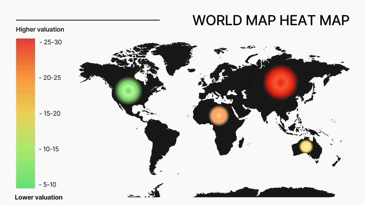
Heat Map, World Map, Color-Coded Valuation, Clear Legend

Tags

Simple World Map Heat Map Infographic

Edit Online! Free Google Slides Template!

Created: None
Category: Slides
Userbase: Business Analysts, Marketers, Data Scientists, Researchers
Layout: Single Column with Heat Map and Legend on the Left
Colors: Red, Green, Yellow, Orange

Description

This infographic is a world map heat map that visually represents data valuation across different regions. It uses a color-coded scale to indicate varying levels of valuation, with red representing higher values and green representing lower values. The layout includes a clear legend on the left side for easy interpretation.

Free Google Slides template and PowerPoint template designed for creating visually engaging presentations, the Simple World Map Heat Map Infographic allows you to effectively showcase geographic data and statistics with ease. This template is ideal for educators, business professionals, and researchers who need to illustrate trends, distributions, or performance metrics across different regions. Featuring a clean and modern design, it offers customizable color schemes and data layers to highlight key insights on a global scale. Free Google slides template and PowerPoint template – more free office templates can be found at GSlides.com.